
Do you like colors? Have you ever thought about how important they are in making things look nice and attractive?
Colors play a big role in making things look good, especially in designs. And when it comes to designing things for the summer season, it’s important to choose the right colors that capture the essence of summer.
In this article, we’re going to talk about 50 gorgeous true summer colors that can inspire your designs.
We’ll explain what summer colors are, how to choose them, and show you examples of how they can be used. So get ready to learn all about the best colors to use for your summer designs!
Table of Contents
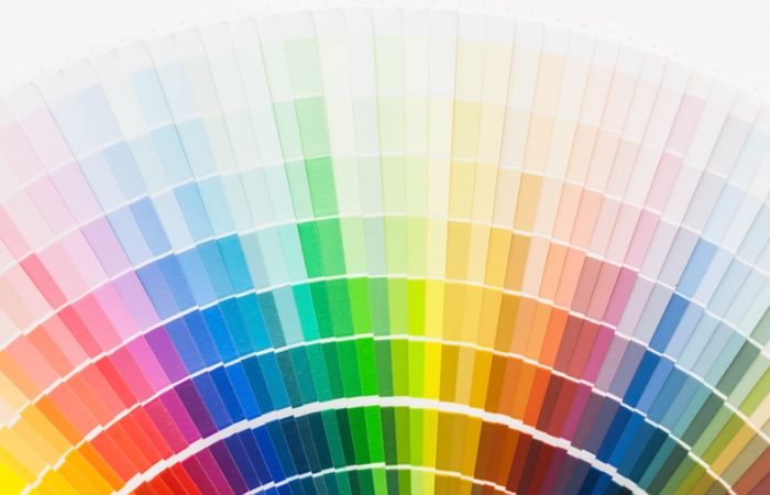
What Is a Summer Color Palette?
A summer color palette features soft, cool, and muted colors that capture the feel of summer. It’s part of a system that matches colors to a person’s natural skin, hair, and eye tones. The summer palette is usually split into three groups: True Summer, Soft Summer, and Light Summer.
Quick Guide: Summer Color Palette
So, what exactly are summer colors? Well, summer colors are a group of colors that are typically associated with the summer season.
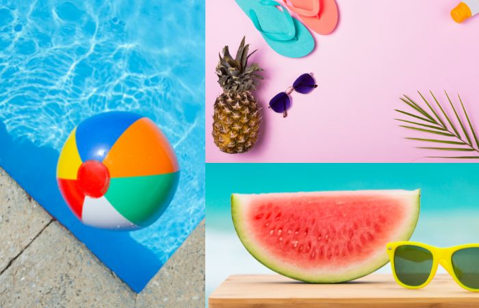
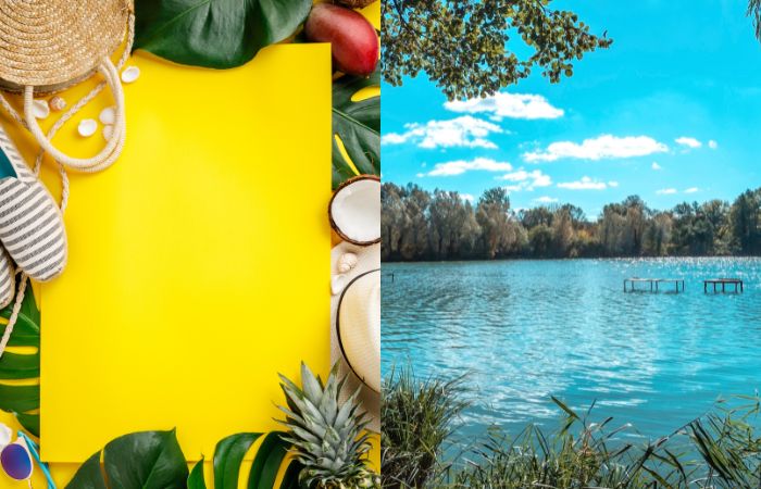
Think of the colors you see around you during summer – bright blue skies, lush green trees, and beautiful flowers in shades of pink, yellow, and orange. These colors are all part of the summer color palette.
When it comes to choosing colors for your summer designs, it’s important to think about the context and purpose of your design.
Are you designing a poster for a beach party or a flyer for a summer camp? Depending on the purpose, you may want to choose colors that evoke a certain emotion or feeling.
For example, using a bright yellow color can make people feel happy and energetic, while a cool blue color can make people feel calm and relaxed.
So, the key to choosing the right summer colors is to think about the context and purpose of your design and choose colors that match the feeling you want to convey.
Here are answers to some common questions.
What to Pack for Colorado in Summer?
When packing for Colorado in the summer, it’s important to consider the diverse weather conditions and outdoor activities available in the state. The following items are essential:
- Layered Clothing
- Rain Gear
- Comfortable Shoes
- Outdoor Gear
- Insect Repellent
- Travel Essentials
Can You Ski in Colorado in the Summer?
Yes, it is possible to ski in Colorado in the summer. While most ski resorts in Colorado operate during the winter months, there are a few resorts that offer summer skiing and snowboarding opportunities. One of the popular destinations for summer skiing in Colorado is Arapahoe Basin, which has a high elevation and often extends its ski season into late spring and early summer. Another option is the nearby Loveland Ski Area, which also occasionally opens for summer skiing.
What Color Is Summer?
The color of summer can be described as vibrant and lively. It is often associated with shades of bright yellow, lush green, sky blue, and vibrant floral hues. The warmth of the sun, the blossoming of nature, and the clear blue skies contribute to the colorful essence of summer.
What Are Some Summer Colors?
Some popular summer colors include vibrant shades like bright yellow, turquoise blue, coral pink, refreshing mint green, sunny orange, and crisp white. These colors evoke the feeling of warmth, energy, and relaxation associated with the summer season. They can be seen in fashion trends, home decor, and even nature during this time of the year.
50 Gorgeous True Summer Colors Palette Designs
Get inspired by these stunning and vibrant color palettes that capture the essence of summer. Elevate your design projects with these 50 true summer color palette designs that range from cool and refreshing to warm and to invite.
True Summer Color Palette
Let’s start with Electric Blue (#7DF9FF).
1. Electric Blue (#7DF9FF)

Electric Blue is a striking and vibrant color that evokes the feeling of clear summer skies and sparkling ocean waters. Add a pop of Electric Blue to your summer palette to create a bold and refreshing look that captures the energy and spirit of the season.
2. Lemon Yellow (#FFF44F)

Lemon Yellow is a bright and cheerful color that embodies the warmth and energy of summer. Adding Lemon Yellow to your summer colors can bring a playful and refreshing vibe to your designs.
3. Coral (#FF7F50)
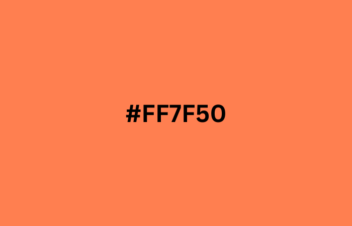
Coral is a popular summer color that exudes warmth and energy, making it perfect for a wide range of designs. Whether you’re creating beach-themed artwork or designing a summer fashion line, Coral (#FF7F50) is a versatile and vibrant color choice that will add a touch of summer radiance to your projects.
4. Turquoise (#40E0D0)

Turquoise is a perfect summer color that embodies the clear blue waters of the ocean and the bright skies of summer. This refreshing shade of blue-green adds a tropical touch to any design project and perfectly captures the carefree spirit of summer.
5. Salmon (#FF8C69)
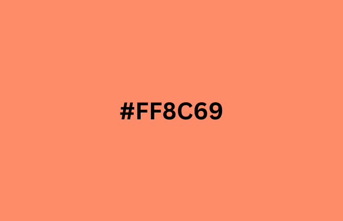
Salmon (#FF8C69) is the perfect addition to summer color palette clothes, adding warmth and a pop of color. Use Salmon (#FF8C69) in your summer designs to evoke feelings of sunny days, tropical destinations, and seaside adventures.
6. Sea Green (#2E8B57)
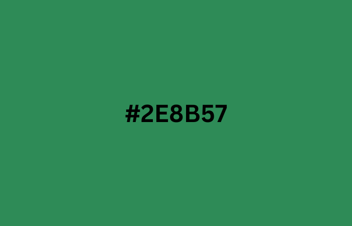
The refreshing and calming shade of Sea Green (#2E8B57) is the perfect addition to any true summer colors palette. This beautiful hue evokes images of the ocean and the lush greenery of summer landscapes, making it a great choice for any summer-inspired design project.
7. Sky Blue (#87CEEB)
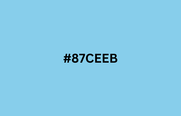
Sky Blue is a refreshing and cool color that perfectly captures the essence of summer. Incorporating Sky Blue (#87CEEB) into your summer colors palette will bring a sense of tranquility and calmness to your designs.
8. Fuchsia (#FF00FF)
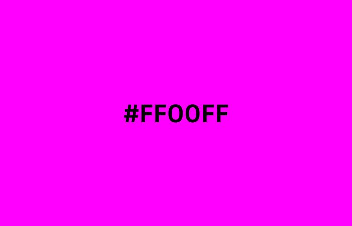
Fuchsia is a vibrant and bold color that adds a pop of excitement to any summer colors palette. Incorporating Fuchsia into your summer palette can add a touch of energy and playfulness to your designs.
9. Burnt Orange (#CC5500)
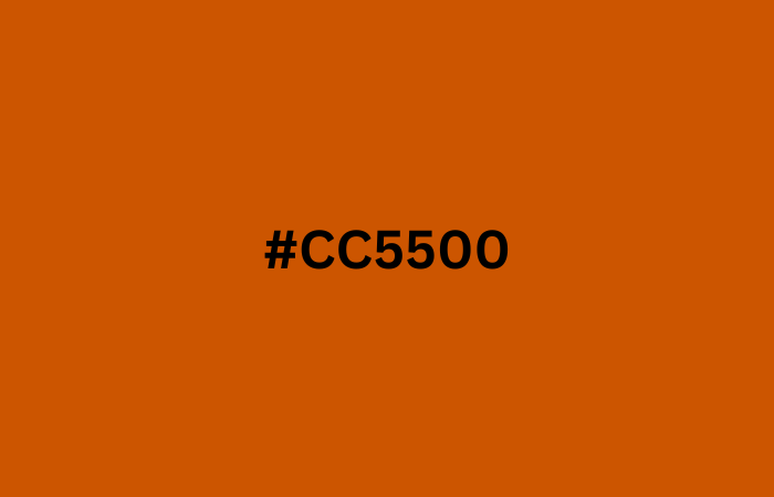
Burnt Orange is a warm and bold color that adds a touch of summer energy to any design project. Incorporating Burnt Orange into your summer palette can create a dynamic and eye-catching color scheme that’s perfect for summertime designs.
10. Deep Sky Blue (#00BFFF)
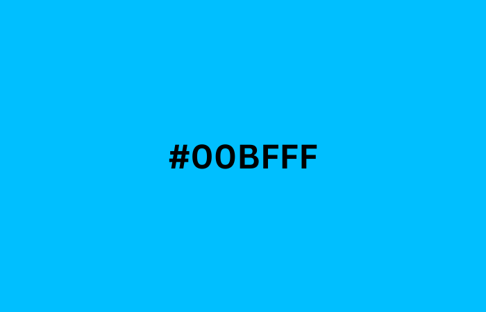
Add a refreshing touch to your designs with Deep Sky Blue (#00BFFF), a cool and calming shade that evokes the feeling of clear blue summer skies. This beautiful hue pairs well with other summer colors palette and can be used in a variety of design projects, from beach-themed posters to summer fashion campaigns.
Light Summer Color Palette
Let’s start with Peach (#FFE5B4).
11. Peach (#FFE5B4)

Peach (#FFE5B4) is a soft and warm color that brings a touch of sweetness to the light summer colors palette. This delicate shade of peach is perfect for adding a subtle pop of color to your light summer design projects, from wedding invitations to floral patterns.
12. Lavender (#E6E6FA)

Lavender (#E6E6FA) is a soft and dreamy color that perfectly complements the light summer colors palette. Use Lavender (#E6E6FA) in your design projects to add a delicate and soothing touch of color to your creations.
13. Powder Blue (#B0E0E6)
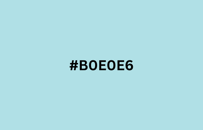
Powder Blue (#B0E0E6) is a refreshing and calming color that is perfect for summer-themed designs. This soft shade of blue brings to mind clear skies and tranquil waters, making it a great choice for creating a serene and inviting summer atmosphere.
14. Pale Yellow (#FFFF99)

Pale Yellow is a warm and inviting color that evokes the feeling of sunshine on a lazy summer day. Incorporating Pale Yellow into your light summer colors palette clothes can add a cheerful and playful touch to your designs.
15. Light Coral (#F08080)
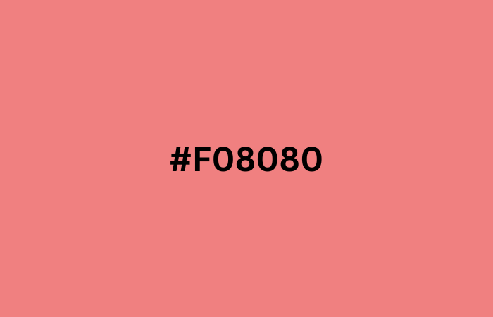
Light Coral (#F08080) is a perfect addition to any summer palette, adding a touch of warmth and femininity. This soft and delicate shade of pinkish-orange can evoke feelings of joy, comfort, and relaxation, making it a popular choice for summer designs.
16. Light Grey (#D3D3D3)
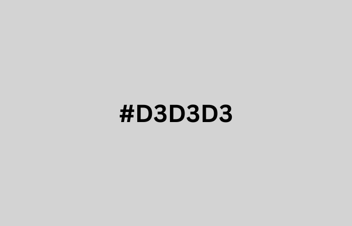
While not a typical summer color scheme, Light Grey (#D3D3D3) can add a touch of sophistication to a summer palette. Light Grey (#D3D3D3) is a versatile color that can be used as a neutral base or paired with bright pops of color for a summer-inspired design.
17. Light Blue (#ADD8E6)
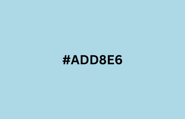
Light Blue (#ADD8E6) is the perfect shade for capturing the tranquility of a summer sky. Use Light Blue (#ADD8E6) in your summer designs to evoke feelings of calmness, relaxation, and serenity.
18. Powder Pink (#FFB6C1)
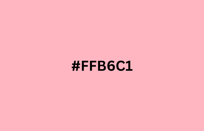
Powder Pink is a soft and delicate hue that adds a touch of femininity to any summer palette. Incorporate Powder Pink into your cool summer palette colors for a romantic and charming feel that evokes the warmth and beauty of the season.
19. Light Purple (#AFEEEE)

Light Purple (#AFEEEE) is a perfect addition to any light summer colors, as it captures the soft and dreamy feel of a summer day. Incorporating Light Purple (#AFEEEE) into your summer designs can create a refreshing and calming effect, making it an excellent choice for beach-themed designs or summer-inspired logos.
20. Thistle (#D8BFD8)
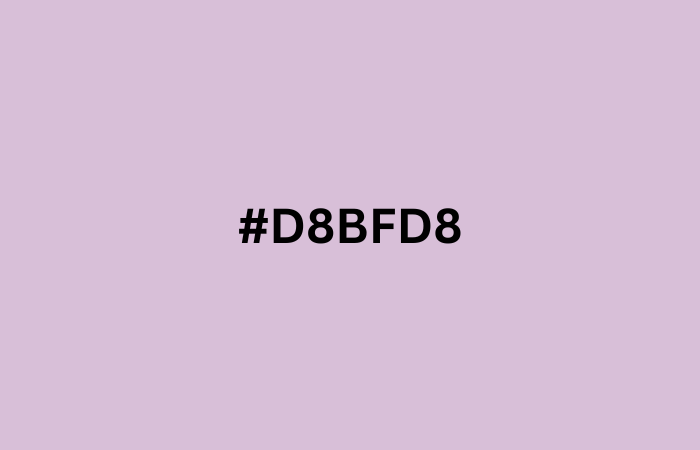
Thistle, a soft purple with hints of gray, is the perfect addition to a light and airy light summer color palette.
Cool Summer Color Palette
Let’s start with Aqua (#00FFFF).
21. Aqua (#00FFFF)
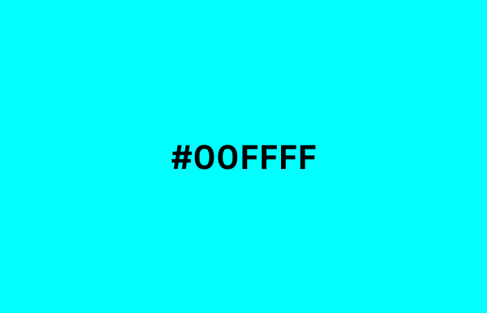
Aqua is the perfect color for a refreshing and cool summer palette reminiscent of the ocean and clear blue skies. Whether you’re designing a beach-themed poster or a summer fashion line, Aqua (#00FFFF) adds a splash of fun and vibrancy to any project.
22. Chartreuse (#7FFF00)
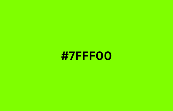
Chartreuse, a bright and bold green-yellow hue, adds a refreshing touch to the cool summer color palette. Use Chartreuse in your design projects to infuse a pop of energetic and lively color that evokes the spirit of summer.
23. Lilac (#C8A2C8)
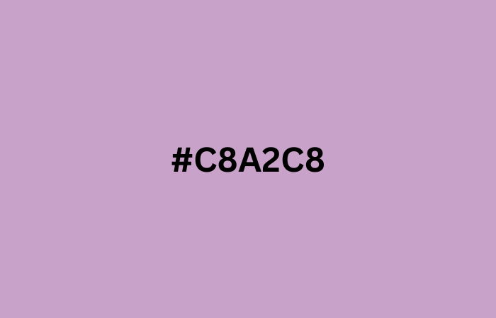
The cool summer color palette gets a touch of sophistication with the delicate Lilac (#C8A2C8) hue. Pair Lilac (#C8A2C8) with other colors from the cool summer palette to create a refreshing and calming design.
24. Olive Green (#808000)
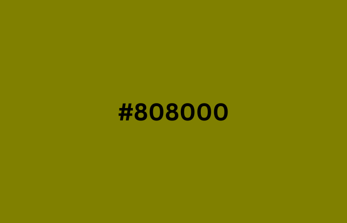
Olive Green (#808000) is a versatile and earthy tone that adds a natural touch to any summer color. Use Olive Green (#808000) in combination with other vibrant summer colors to create a refreshing and balanced palette for your design projects.
25. Steel Blue (#4682B4)

Steel Blue (#4682B4) is a refreshing and cool color that perfectly captures the essence of summer. Add a touch of sophistication to your summer colors with Steel Blue (#4682B4), a versatile and timeless hue that complements a variety of other colors.
26. Slate Blue (#6A5ACD)
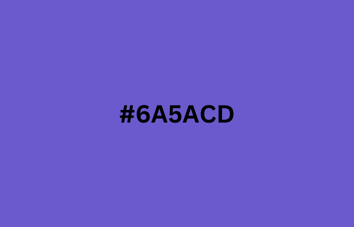
Incorporate Slate Blue (#6A5ACD) into your true summer palette for a refreshing and calming touch. This beautiful shade of blue will add depth and sophistication to your designs, making it a perfect addition to any summer-inspired project.
27. Medium Purple (#9370DB)
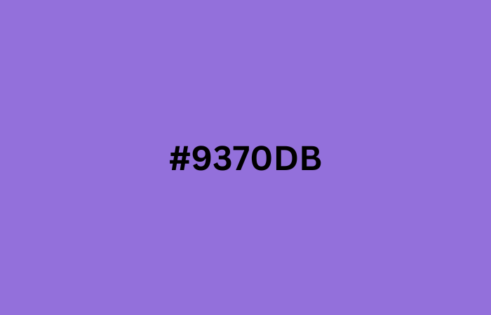
With its cool undertones and subtle hints of blue, Medium Purple (#9370DB) is a perfect choice for creating dreamy and ethereal cool summer palette colors.
28. Dark Slate Blue (#483D8B)
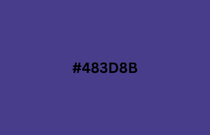
Dark Slate Blue may not be an obvious choice for summer colour, but its deep, rich tone can add a touch of sophistication to your designs. Pair Dark Slate Blue with other warm or cool summer colors like salmon, coral, or turquoise for a balanced and striking summer color.
29. Deep Pink (#FF1493)

Deep Pink (#FF1493) is a bold and vibrant color that adds a pop of energy to any cool summer color palette. Use Deep Pink (#FF1493) as an accent color in your summer designs to create a playful and fun vibe.
30. Dark Turquoise (#00CED1)

Dark Turquoise is a refreshing and versatile color. It adds a pop of cool sophistication to your summer designs with the stunning shade of Dark Turquoise (#00CED1).
Sunset Color Scheme
Let’s start with Tangerine (#FFA07A).
31. Tangerine (#FFA07A)
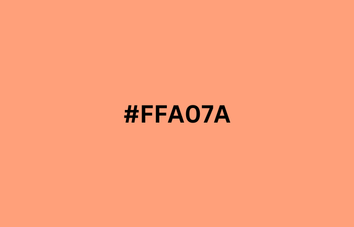
Add a pop of energy to your summer designs with the bold and vibrant Tangerine (#FFA07A) hue. These types of colors are the perfect summer colors for capturing the warmth and zest of summer, whether you’re designing a logo, a poster, or a social media graphic.
32. Tomato Red (#FF6347)
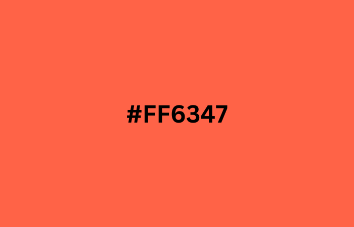
Tomato Red is a bold and vibrant color that adds a pop of excitement to any true summer color palette. Pair Tomato Red with shades of yellow, green, or blue for a summery look that is sure to make a statement.
33. Apricot (#FFB347)

Apricot, with its warm and inviting hue, is the perfect addition to any sunset color scheme. Incorporating Apricot (#FFB347) into your design projects will infuse them with a sense of energy and excitement that’s perfect for the summer season.
34. Salmon Pink (#FF91A4)
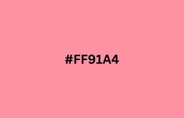
Salmon Pink (#FF91A4) adds a subtle touch of warmth to the summer colors, reminiscent of the pink hues of a summer sunset. With its delicate and feminine tone, It is a versatile color choice for summer designs, from fashion to home decor.
35. Indian Red (#CD5C5C)

Incorporating Indian Red (#CD5C5C) into your sunset color palette can create a warm and inviting atmosphere reminiscent of summer sunsets.
36. Sandy Brown (#F4A460)

Sandy Brown (#F4A460) is a warm and earthy shade that resembles the color of sand on a beach. This versatile color can be used to create a cozy and inviting atmosphere or to add a touch of natural beauty to any design project.
37. Brick Red (#8B0000)
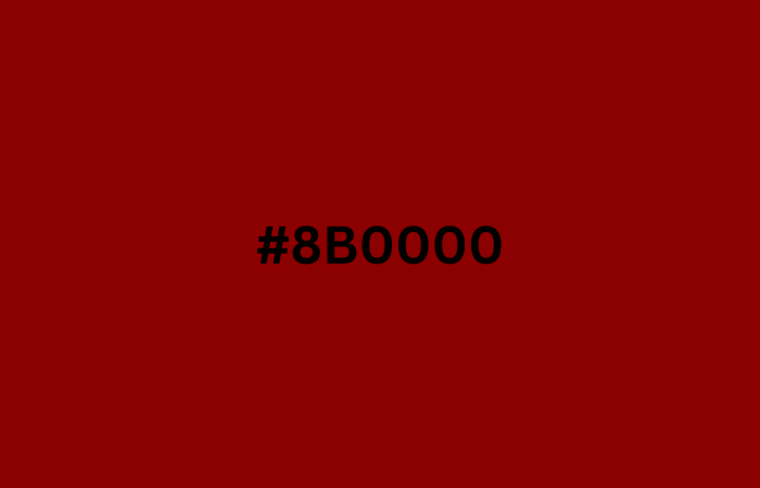
Brick Red is a warm and earthy hue that evokes feelings of strength and stability. This deep red tone pairs well with neutral colors and can add a bold and rich accent to any design project.
38. Dark Salmon (#E9967A)

Dark Salmon (#E9967A) adds a warm and rich tone to the sunset color scheme, reminiscent of a sun-kissed beach. This beautiful shade of pinkish-orange pairs well with other sunset colors like Tangerine and Brick Red, creating a stunning and harmonious color palette.
39. Orchid (#DA70D6)

With its deep, rich hue, Orchid complements the warm tones of a sunset color scheme, creating a beautiful contrast.
40. Mauve (#E0B0FF)
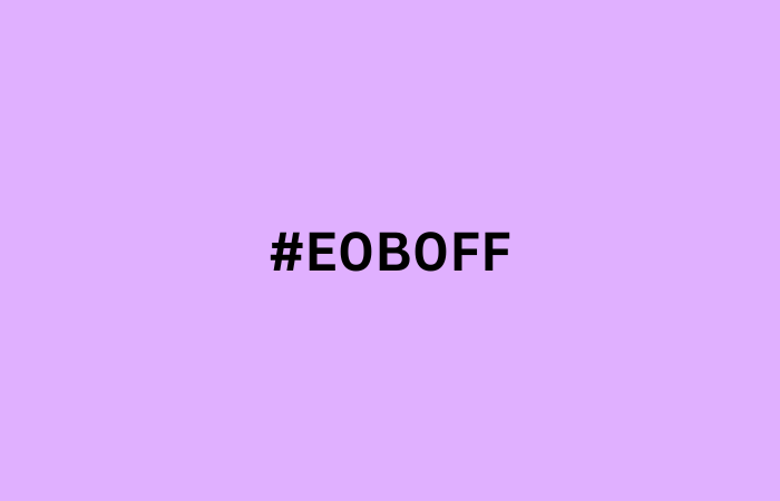
Use Mauve (#E0B0FF) in your sunset color palette to create a dreamy and romantic atmosphere for your design project.
Classic Summer Palette
Let’s start with Gold (#FFD700).
41. Gold (#FFD700)
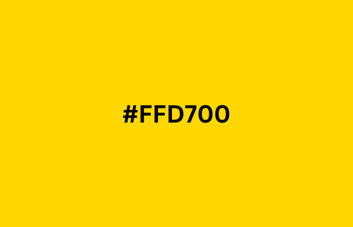
The rich and warm tone of Gold (#FFD700) adds a touch of luxury and sophistication to the Classic Summer Colors Palette. Use Gold (#FFD700) in your design projects to bring a classic summer vibe and a sense of opulence to your creations.
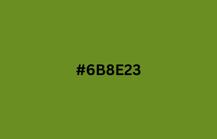
42. Olive Drab (#6B8E23)
Olive Drab is a versatile and earthy shade that adds depth and richness to any classic summer colors palette. With its subtle green undertones, Olive Drab is a perfect choice for creating a natural and organic feel in your summer designs.
43. Forest Green (#228B22)
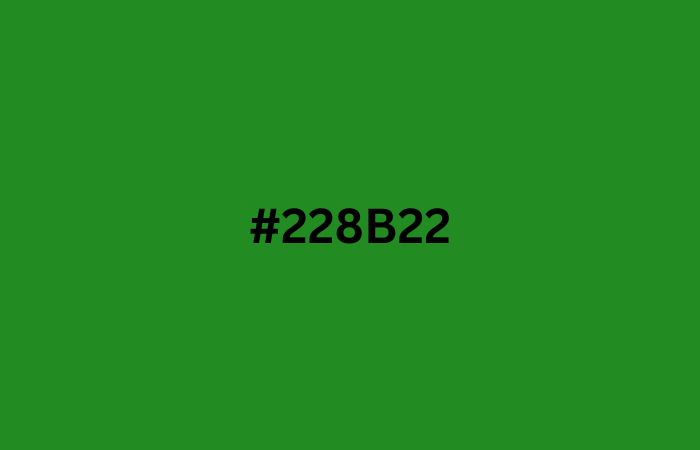
Forest Green (#228B22) is a refreshing and earthy shade that perfectly complements a summer palette. Add a touch of nature to your summer designs with Forest Green (#228B22), a color that evokes lush green forests and summer foliage.
44. Sienna (#A0522D)

Sienna is a warm and earthy tone that can add depth and richness to a summer palette. Use Sienna in your summer palette to evoke feelings of warmth and sun-kissed earth, perfect for designs inspired by nature and the outdoors.
45. Dark Lavender (#734F96)
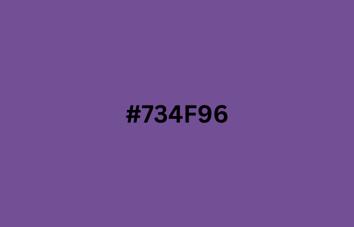
Dark Lavender adds a touch of sophistication and elegance to a summer palette. Pair Dark Lavender with lighter shades to create a balanced and harmonious summer color scheme.
Fresh Color Palette
Let’s start with Lime Green (#32CD32).
46. Lime Green (#32CD32)

Lime Green (#32CD32) is a refreshing and invigorating shade that adds a burst of energy to any design. Use Lime Green (#32CD32) in your Fresh Color Palette to bring a touch of nature and vibrancy to your design projects.
47. Chartreuse Green (#DFFF00)

Chartreuse Green (#DFFF00) is a bright and refreshing color that’s perfect for capturing the essence of summer. Add a pop of Chartreuse Green (#DFFF00) to your true summer colors palette to create a vibrant and energetic vibe in your designs.
48. Bright Yellow (#FFD801)
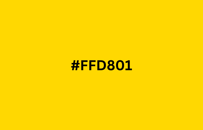
Add a pop of sunshine to your design with Bright Yellow (#FFD801) – the perfect shade for a summer color palette. Whether you’re creating a summer-themed poster, flyer or social media graphics, this cheerful and bright hue is sure to grab attention.
49. Sky Blue (#87CEFA)
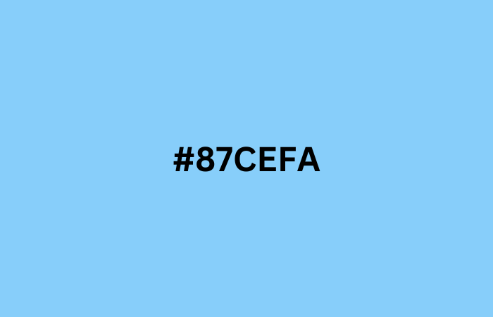
Sky Blue (#87CEFA) is a refreshing and calming shade that evokes clear summer skies and sparkling ocean waters. Use Sky Blue (#87CEFA) in your Fresh Color Palette designs to add a touch of serenity and tranquility to your creations.
50. Dusty Rose (#FFC9B9)
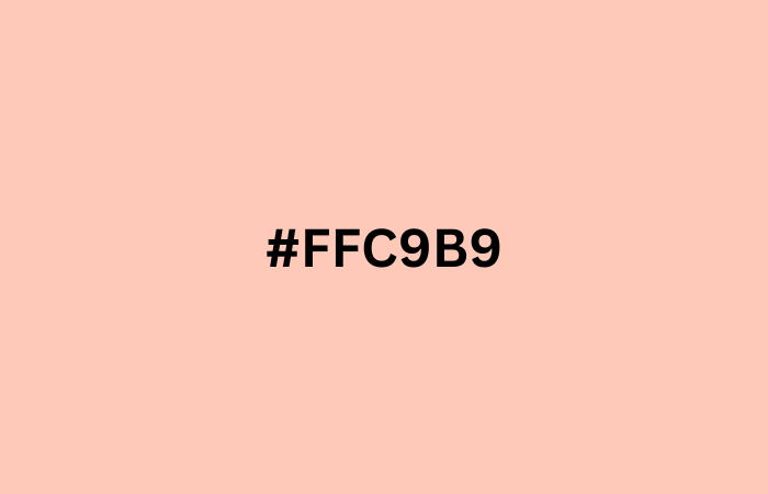
The soft and soothing dusty rose (#ffc9b9) is a perfect addition to the Fresh Color Palette, evoking feelings of calmness and relaxation. Use dusty rose (#ffc9b9) in your design projects to bring a touch of serenity and freshness to your creations.
Summer Wedding Colors
Naturally, we couldn’t overlook the vibrant and cheerful wedding season, which hits its peak between June and September during the summer. Let’s explore some beautiful colors for your special day!
- #DFE7F2
- #F2AE72
- #A69485
- #D98555
- #733620
- #3F688C
- #728EA6
- #AAB7BF
- #025159
- #F2C6A0
- #3D4025
- #D9CDA9
- #A69485
- #F2EAE4
- #8C5230
- #F2E9EC
- #BF7B54
- #D9C4B8
- #734434
- #D94E4E
- #364C59
- #3C4022
- #A69C68
- #D99D8F
- #D9D0D0
- #E9ECF2
- #C7CFD9
- #F2B84B
- #A68A7B
- #8C594D
Soft Summer Color Palette
This summer color palette features calm, soft colors with muted tones. It can sometimes appear washed out, contrasting with bright colors. This is because it blends summer and fall, favoring cool, subdued shades. Examples include blue-gray, lavender, and darker blues and pinks.
- #C5CCD9
- #7F8C4F
- #D9D2C5
- #733C1D
- #A6785D
- #F2A7B5
- #BDB0D9
- #8FA1D9
- #026873
- #01403A
- #037F8C
- #A0D3D9
- #03A6A6
- #BFA89B
- #A6583C
- #D5C7D9
- #C7D9D2
- #9DBF7A
- #A6BF8E
- #A66038
- #BF0436
- #C7CDD9
- #89ABD9
- #169EF2
- #013A40
- #D9A7C7
- #E9C9F2
- #C7B3F2
- #6958A6
- #9F8FD9
Dark Summer Color Palette
The dark summer color palette includes soft, cool shades of blue, gray, and green. These muted tones are more subtle than the usual bright summer colors, making them perfect for creating a calm and elegant feel in fashion, interior design, and branding. The provided hex codes and RGB values help you easily use these dark summer colors in your digital designs.
- #2F4F4F
- #6B8E23
- #6A5D7B
- #78C7C7
- #9B7A7A
- #508B8B
- #3CB371
- #9370DB
- #6A5ACD
Bright Summer Color Palette
These color palettes include a lively blend of pinks, oranges, yellows, greens, and blues that reflect the feel of a sunny summer. The HEX codes give precise RGB values for each color, making it easy to use them in digital designs and websites.
- #ff598f
- #fd8a5e
- #e0e300
- #01dddd
- #FFB6C1
- #FFDAB9
- #FFEFDB
- #FFAC5A
- #5E7F5E
- #ECEAD1
- #C0DCE0
- #CAD2C5
- #E2C4AA
- #FB5B05
Classic Summer Color Palette
These colors are great for summer designs, branding, and decor. The mix of warm and cool tones creates a cheerful and relaxing feel, perfect for the season.
- #FFFF00
- #FF7F50
- #87CEEB
- #7CFC00
- #E6E6FA
Tips for Using the Summer Color Palette
- When using summer colors palette, try combining them in a way that makes sense – like pairing warm oranges and yellows with cool blues and greens.
- Different colors can make people feel different emotions. For example, yellows and oranges can make people feel happy and energized, while blues and greens can make people feel calm and relaxed.
- It’s also crucial to make sure that the colors you use are easy for everyone to see, including people who may have difficulty seeing certain colors. This means making sure there is enough contrast between the colors and avoiding using colors that are too similar.
September Color Palette
Want to learn about the September color palette? Let’s talk about 5 five September color palettes to inspire your designs:
Autumn Leaves
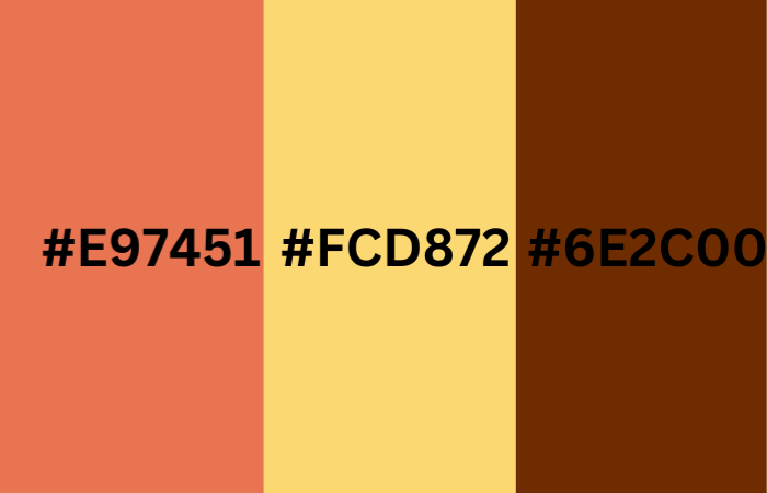
This color palette includes warm shades of orange, yellow, and brown, like burnt sienna (#E97451), goldenrod (#FCD872), and chocolate brown (#6E2C00).
Harvest Time
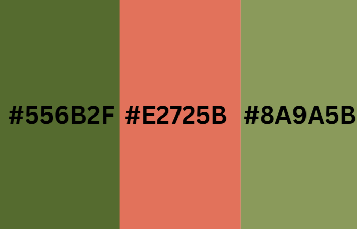
This color palette features earthy tones of green and brown, like olive green (#556B2F), moss green (#8A9A5B), and terra cotta (#E2725B).
Sapphire Blue
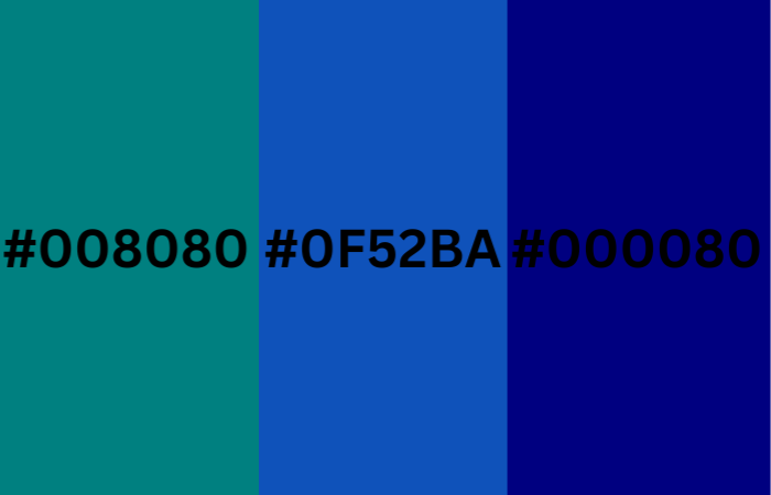
This color palette incorporates various shades of blue, including deep blue-greens like teal (#008080), sapphire blue (#0F52BA), and navy blue (#000080).
Sunny September
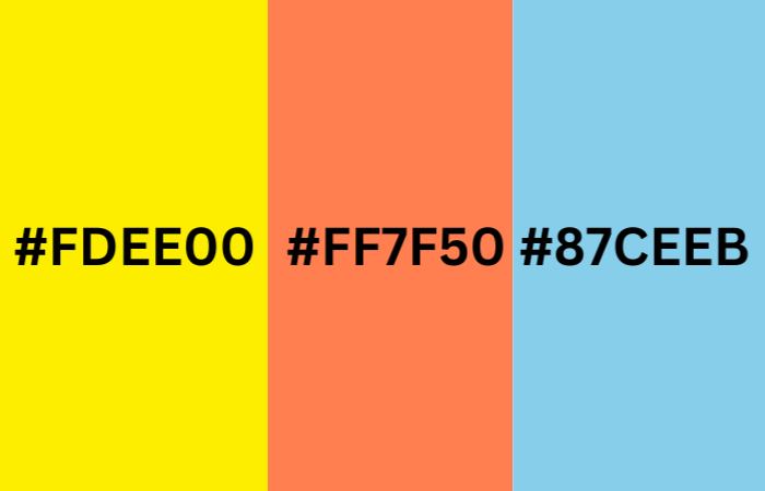
This color palette includes bright and sunny colors, like lemon yellow (#FDEE00), coral pink (#FF7F50), and sky blue (#87CEEB).
September Skies
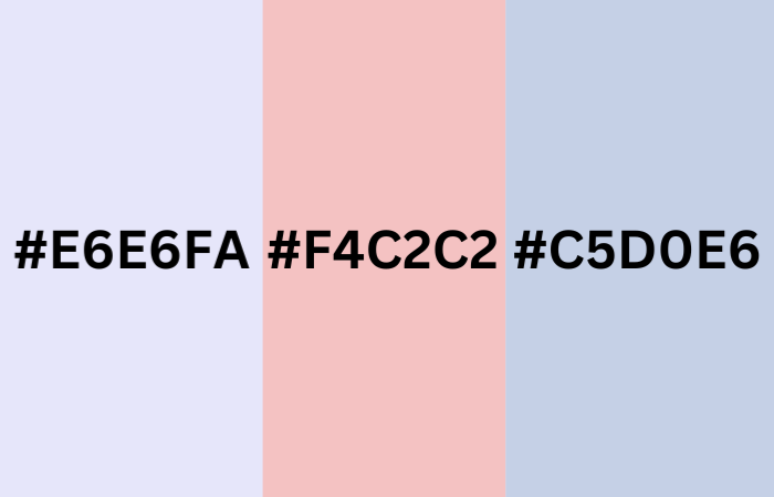
This color palette is inspired by the changing skies in September, featuring soft shades of pink, purple, and blue, like lavender (#E6E6FA), baby pink (#F4C2C2), and periwinkle blue (#C5D0E6).
So Autumn Leaves, Harvest Time, Sapphire Blue, Sunny September, and September Skies could be incorporated into a September color palette.
Conclusion
In conclusion, we’ve explored 50 gorgeous true summer color palette designs that are perfect for adding a touch of summer to your design projects.
Some summer colors house of colour includes soft shades of pink, purple, and blue, as well as cool greens and grays, which are included in this list.
We’ve also provided some tips for using these summer colors palette effectively, including considering color combinations, emotional responses, and accessibility. Remember, the best way to find the perfect color palette for your project is to experiment and have fun! So don’t be afraid to try different colors and see what works best for you.
FAQs on Summer Color Palette
What are the colors of Summer?
Some classic summer colors include shades of yellow, orange, pink, and red, as well as cool blues and greens that evoke the refreshing feeling of a dip in the pool or a day at the beach.
What are cool Summer colors?
Some examples of cool summer colors include light aqua, seafoam green, lavender, and periwinkle. Using cool summer colors in your design projects can help create a refreshing and soothing atmosphere that’s perfect for the warmer months.
What colors give Summer vibes?
Colors that give off summer vibes include warm and bright colors like yellows, oranges, and pinks, as well as cool and refreshing colors like blues and greens.
Is green a summer color?
Yes, green is definitely a summer color! In fact, many shades of green are commonly associated with summer, such as bright lime greens, lush forest greens, and cool mint greens.
Is Red a Summer Color?
Yes, red is often considered a vibrant and energetic color that can be associated with the summer season. Its warm and fiery tones are reminiscent of the sun, and red hues are commonly seen in summer fashion, accessories, and outdoor decorations.
What colors are in the summer palette?
The summer color palette features soft and cool shades, like light pinks, blues, greens, and deeper colors like charcoal gray and navy blue. True summer colors are balanced—not too light or dark—and lean towards cooler tones.
What colors are best for summer?
Some of the best colors for summer are sky blue, which feels like a clear summer sky and helps you stay cool, mint green, which is refreshing and perfect for summer wear, pale gray, a stylish and cooler alternative to white, soft lavender, which is calming and chic for hot days, and white, a classic color that effectively reflects light and heat.
Read next: